
THE ORIGINAL AND STILL CURRENT LOGO


REBRANDING OPTIONS
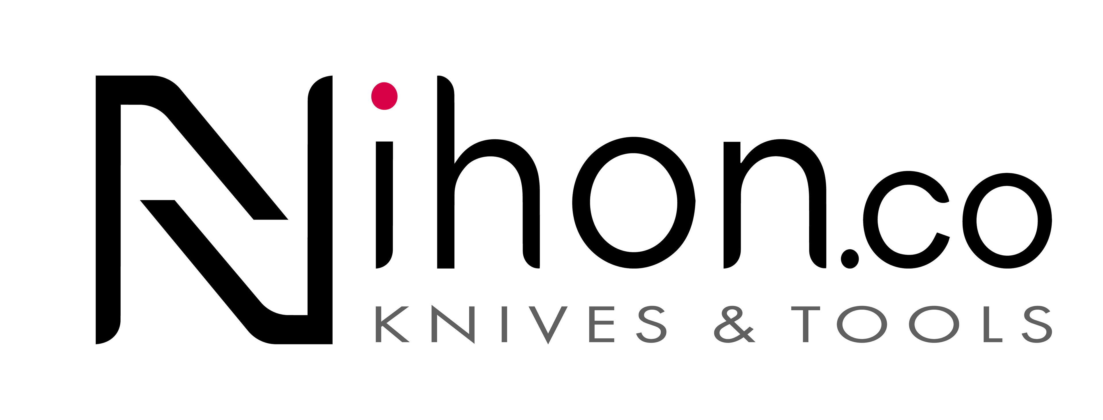
FINALISED REBRAND OPTION
Pro Tooling is a local knife shop which specialises in hand-crafted Japanese kitchen knives, whetstones, and woodworking tools. They also have a range of other products, but Japanese products is their main focus. Because their main focus is Japanese products, the rebrand was going from Pro Tooling to Nihon.Co. So I was experimenting with Japanese themes while doing this rebrand. "Nihon" also means "Japan" in Japanese. Unfortunately, after finalising the logo rebrand, the client received some feedback from one of their main Japanese suppliers saying that the naming the brand "Japan" wasn't the best. The rebrand was put on hold, but the client was still very happy with the work and effort I put into the rebrand, and will reach out when it's being put back into motion. I designed the logos in Illustrator.