
I experimented with quite a few different fonts. They were after something simple and clean, and ideally without serifs. However, they were alright with some serifs. The red stars mark the ones they felt were the strongest, and I began to build off of those.

They selected a final six that they thought were strongest, and then asked if I could do a few versions with and without the dots. The versions with just the dots are for a possible flashing neon sign.
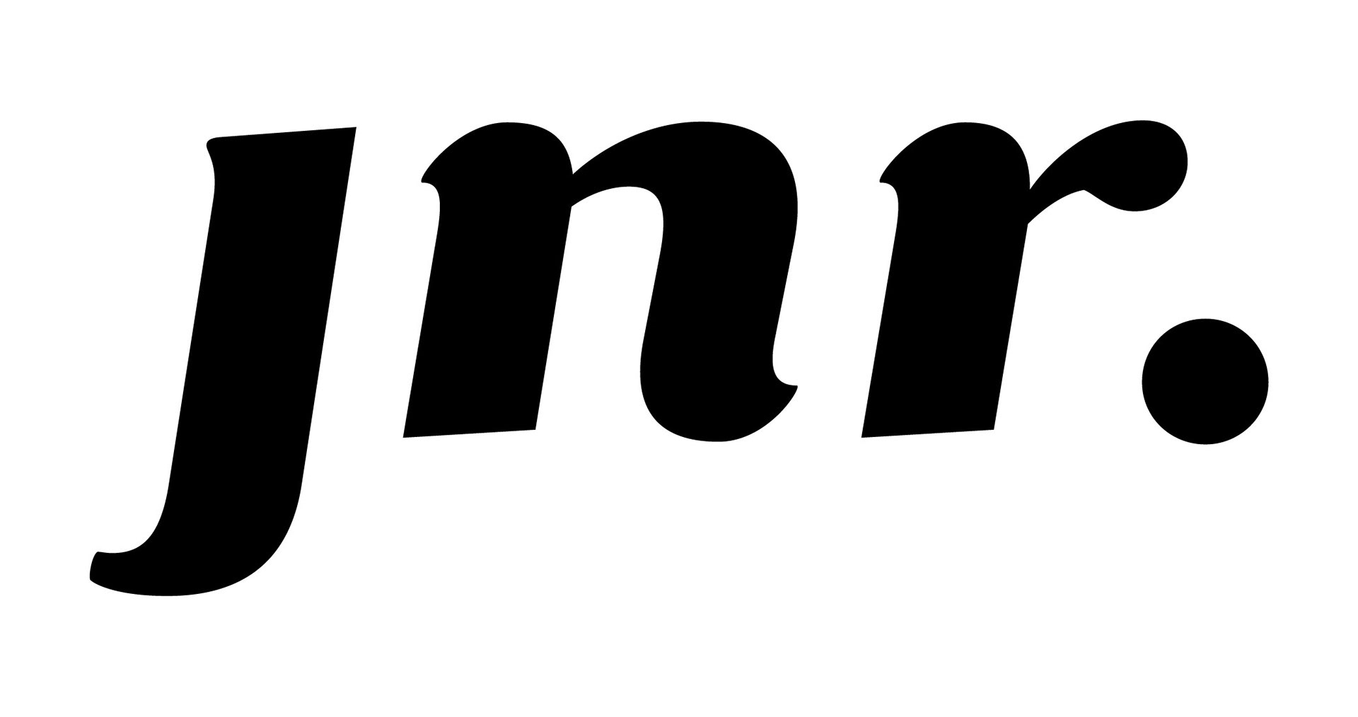
JNR. FINAL LOGO DESIGN